Apr 30, 2008

The Monkey Box

Downtown Natchitoches, LA, showing brick streetsImage via Wikipedia
I love it when I find something special. Especially when I'm not looking. It happened to me this weekend on a trip to Natchitoches, Louisiana. We were browsing the antique stores and shops with no particular purchase in mind; mostly just window shopping.

One of the stores we visited had two floors of items. It was kind of like visiting a museum. Some of the things I saw brought back old memories from when I was a kid. This place had every kind of bauble you could imagine old toys, tools, every kind of old bottle or container, records...I could go on and on. In fact, It had so much stuff that it all started to blend together.


But then, in the last room, I spotted the oddest, most eye catching item in the whole place. I took to it immediately.

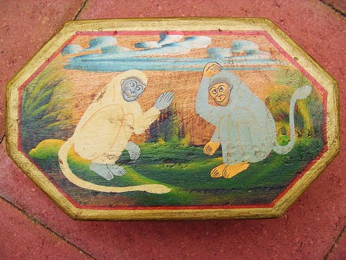
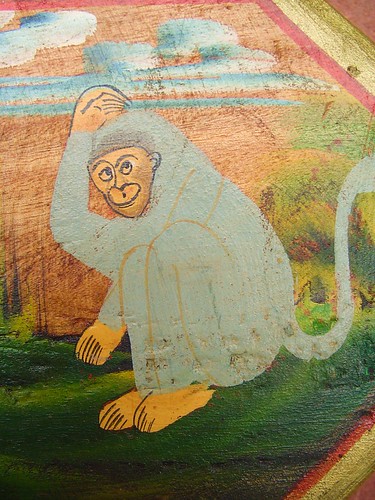
I saw the Monkey Box.

I turned it over, looking for a price.

$6.95. A steal in my book.

Out of two floors of items (and I really mean a lot of items) this one piece jumped out and demanded my attention.

Without hesitation I snatched it up and quickly paid the $6.95.


I've been asking myself what it was about this piece that made me stop in the first place. What about it prompted me to purchase it so quickly? Here's what I've come up with.

  1. It was unique, with it's own character and voice. Sure, there were other interesting items there, but the Monkey Box didn't really fall into a specific category. If everything else in the shop set the tone for what was the norm then the Monkey Box broke that standard right in two. It was simply out of the ordinary.
  2. It had strong, simple images and great color. I spotted it immediately.
  3. It was a box, but it wasn't a basic rectangle or square, which was really cool. There were some other containers on the shelves, jewelry boxes and things like that, but the shape gave it an eye catching edge over the other items.
  4. It looked friendly...really. Nothing hard about it. Now, don't ask me to tell you exactly what it was about it that made me feel that way. Perhaps it's just the monkeys themselves, the looks on their faces. Who knows, but for whatever reason that's the way it came across.
  5. It looked hand made, authentic, not produced by a machine or assembly line. I didn't feel like I was buying something that anyone else had. I mean, come on; who would want an empty box with some monkies painted on top (unless you collect monkey nik-naks)? It wasn't hiding any of its imperfections.
  6. The price was great. I didn't feel snaked (yeah, yeah...I know; who would want a monkey box). I like unique items and I especially like it when I don't have to pay a lot for them, but actually I would have probably paid more for this item because I really liked it a lot.


So, you may be scratching your head, wondering "what does this have to do with the creative profession? Where's the tip? Where's the tidbit?" Well, here it is.
The Monkey Box provides a simple formula for getting noticed in an increasingly cluttered market place.
  • Be unique
  • Find your voice
  • Have character
  • Use strong images
  • Use great color
  • Twist on an existing idea
  • Be friendly
  • Be approachable
  • Be authentic
  • Be useful
  • Be fair


Good advice for those of us who are in the business of graphic communication.

Heck...I think it's good advice in general.

Peace. -O
Enhanced by Zemanta

Apr 15, 2008

Vanity, Mistake or Genius: An Outdoor Advertising Oddity

It's not a trick. Your eyes don't deceive you. No Photoshop editing here. You are actually seeing double.


In my last post I talked about digital outdoor and how you have to keep them simple so people actually have time to read the message. I'd say that's sound enough advice. But here's a solution that never occurred to me. Why put up one board, when you can put up two? The strangeness of it alone makes you look.

Just like one of those folks who saw Jumpin' Jack Flash or Bigfoot, I immediately pulled over and snaked a photo. A couple of thoughts that crossed my mind:
  • Was this on purpose? If so, is it actually a good tactic? It sure made me look, of course not at the actual message.
  • If it was an accident, then how did the paper installer not notice? Seems like as good a reason as any to call into the office and find out if there has been a mistake.
There was a part of me that was hoping that it was on purpose, that someone had a wild hair idea and said "I'm gonna go for it!" But alas, my hopes of finding a maverick advertiser were busted a few days later when I saw the outdoor company pulling the bottom board off.

It looks like someone (probably the business owner) actually noticed that they had put the same board up twice and asked them to correct their mistake. Sorry folks, but this two headed calf ended up being an oversight.

Apr 8, 2008

A Series Of Small Acts: Building A Better Planning Pad


I'm always trying to figure out the best way to kick-start a project. I've tried a lot of different things over the years, but none of it seems to stick.

I've been using the same basic formula for many years now.

  1. I always carry a notebook and write everything down (phone numbers, meeting notes, checklists, etc.)
  2. I always carry a sketchbook so I can capture quick doodles, mind maps and measurements.
  3. I take the combination of the two and try to boil the information down so I can get started.

Sounds really easy, doesn't it? Well apparently getting started is not as easy as it sounds. What I'm finding is that the busier I get and with the increasing quantity of information that I have to process, my time from the actual project meeting or brainstorming session to action is getting longer and longer. I've got good notes, mind maps and sketches, but turning that information into usable action is getting harder and harder.

I've been struggling with the problem for a while, because it seems that it's the same story everywhere I go, all across the creative spectrum; too much information, too tight a deadline and not enough hours from sun-up to sun-down to get things done.

I'm making another attempt to solve it. Funny thing is that I've read the answer over and over again in the Tao Te Ching. "See the small as large and the few as many. Accomplish the difficult task through a series of small acts." -Lao Tzu


A series of small acts....hmmm.

That simple statement has led me to develop a project pad prototype for us folks who work in the creative industries. It's designed with one goal in mind; take your notes, sketches and mind maps and then transfer your key information to this sheet. Use that information to develop your concept quickly and identify 5 first steps toward making your project happen.

Sounded like a simple idea to me.

So I sat down and worked through a project that had been swirling around in my mind. My first step to creating this prototype was identifying the keys to my creative process after a meeting.


My Project:
Give the project a name. Something memorable and simple.

Project Clock:
Set a rough time line for yourself. When will you start? When do expect to have something to proof out? When would you like to be (or have to be) finished?

The Math:
I'm always dealing with measurements, folds, page counts, sizes and quantities. Get your number down on paper. It doesn't matter if you have all the info just yet.

Just Doodle Something:
Sketch out your ideas. Look at your sketches from your meeting. Got any ideas in there that are better than others? Capture those ideas and flesh them out a little further. Work out your folds or die cuts. Allow new ideas to form. Settle on a design path.


Colors:
Pick some. I usually start with four. I use a really simple little vector tool I developed called swatch prisms. This is the easiest thing you can do. What is the vibe of the project? What emotion are you going for? Find a palette to begin with. You can always change it later.

Fonts:
Pick a font or fonts. You're going to have to do this eventually anyway. Why not do it now? If you don't like it you can always pick another. Remember, you're just trying to take some quick action.

First Steps:
Break it into small bites. Baby steps. I read somewhere that momentum only builds once you actually get moving. The key here isn't to figure everything out; it's just to do something, to move from idea to action. Once you have actual footprints on the project it will evolve and things will begin to come together.

Brain Blips:
Let new ideas arise. You've gotten this far and the juice is probably flowing. Good ideas may start coming to you. Capture these blips as they arise. Give them a try. Who knows? They may not work on this project, but there could be one down the road that it could work on.

The Fringe: Go outside of the lines. Be organic and allow yourself room to just work out the kinks. Every idea can't be defined by a box or category. It's okay to let some things be nameless. Jot down your fringe ideas as you move through the process. That's the raw, pure stuff that comes from the creative principle deep inside. Make room for that.


What I've tried to develop here is something that compliments my creative process. I'm hoping that as I use this more and more I'll be able to make movements on my projects much quicker, avoiding that creative brain freeze that we all get from time to time.

I don't know about you folks, but my deadlines are tighter and tighter, which means that I can't afford to get bogged down. On every single project I need to come up with a plan and get moving quickly. I hope the simple formula that this project pad represents will help.

I invite you to download my project sheet and give it a test drive. Does it work for you? Are there areas that it doesn't address? Anything that you'd like to see added or revised? My hope is that it will get you from zero to action on your next project in no time.

Read this doc on Scribd: Parker Brand Project Pad PROTOTYPE

Apr 2, 2008

You Got 8 Seconds: A Look At Digital Outdoor


Parker Brand: A Look At Digital Outdoor from Oran Parker on Vimeo.

Vinyl and paper billboards are dead...

at least it's starting to look that way at the intersections in Lake Charles, Louisiana. The digital billboard is here and I think we'll be seeing more and more of these on the landscape.

Ever see the movie "Minority Report?" Those of you who have may remember the advertising in that movie (sample video below).


Digital advertising. All of it, customized to the individual viewer. I'd say that the appearance of the digital billboard is a first step towards seeing some of the types of advertising from that film actually become a reality.

I have a few quick thoughts that I'd like to share about this new type of board.

The Pros
  • File Size (You can work at 72 dpi and the proportions that I've worked with have been no greater than 1400 pixels wide. That makes for much smaller file sizes, which means you can get from start to finish much faster.)
  • Message Variety (Whether you post one design on the board or ten, it doesn't really matter. Send them all and have them rotate every cycle.)
  • Bright at Night (Traditional billboards may or may not have lights shining on them, but not these babies. You can really see them at night and if the design is right then you've got a winner.)
  • Instant Changes (If you have a message that you need to get up immediately then you are just a few clicks away from making the change yourself. No more waiting for the paper to get posted. Get online and post it yourself, then take it down when it's done...it's that easy.)
The Cons
  • File Size (Sure...you can work at 72 dpi, but do you really want to? Working at that size may speed you up, but it certainly doesn't leave you with a set of design elements that you'll be able to reuse on other projects. Try using those graphics for your client's posters or printed materials. No dice. So, you can work small, but ultimately it doesn't benefit you in the long run.)
  • More Work, Less Time (Ah...the good 'ol days of setting up a board and seeing that one design up for a month or more. The possibility of multiple message going into rotation all at once means that you've got three times the design work to do and less time to do it.)
  • Image Quality (Yeah...they're bright and that's great, but the quality is still not quite there. They've gotten better, but you've got to be real careful about the size of the text in your messages. The small stuff is gonna blow right out.)
  • Think Fast (Your message is only up for 8 seconds...that's it...and that's not much time, so you've got to boil that message down to its essence or it's not gonna register. If you thought that simplifying your message was hard before then get ready because these boards are up for even less time than most web banners...and your audience is in transit.)
  • Red Light, Green Light (These boards can be entertaining while your sitting at an intersection, but watch out! I've noticed that when the boards change it kind of flips a switch in the brain, the same switch that gets flipped when a light changes from red to green. This has happened to me on more than one occasion. You're sitting at a light, you see the board change and your brain says "GO." You hit this gas and then SLAM! They may get the message across but they are also an incredible distraction. Be cautious when viewing these things and don't "zone out" on them.)
Like I said, these boards are here to stay and they'll more than likely evolve as time goes by. I think these boards are a fascinating medium and if used properly can be a very useful advertising tool. On the flip side, do we really need one more distraction on our congested city streets? If these boards are a sign of one thing then it's this; advertising is changing fast and the time we have to go from concept to completion is getting shorter and shorter. Better put on your thinking cap.